Overview
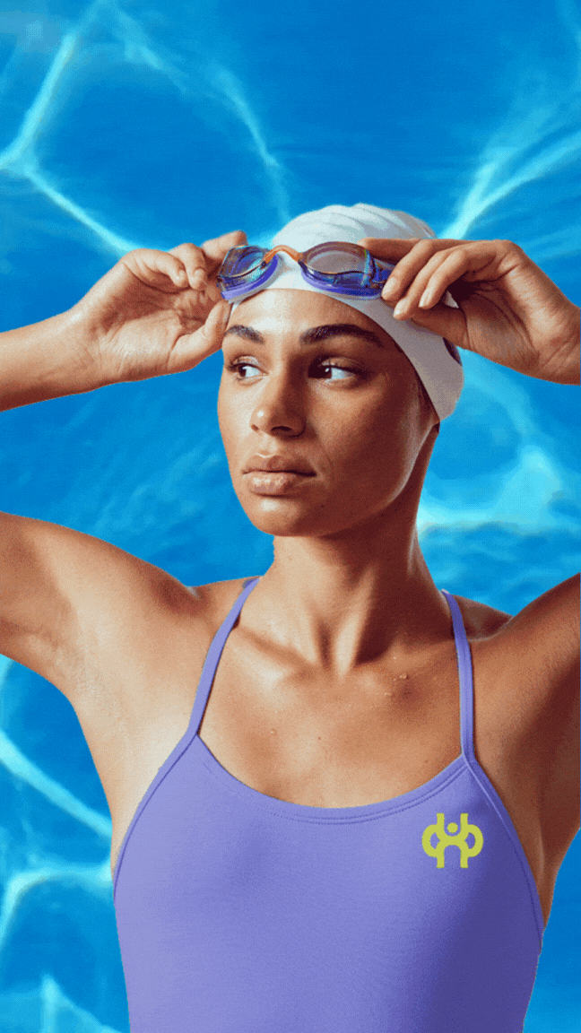
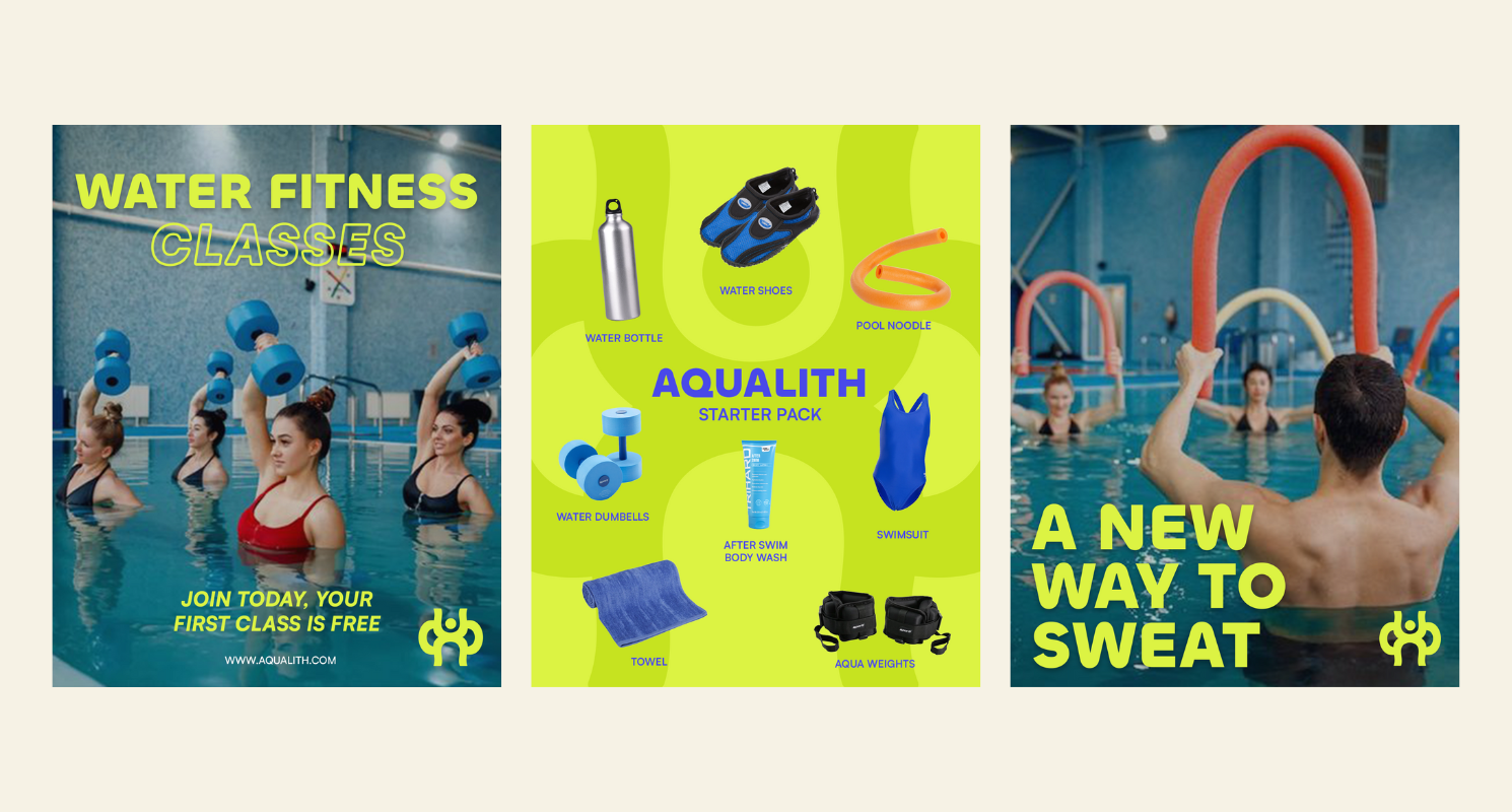
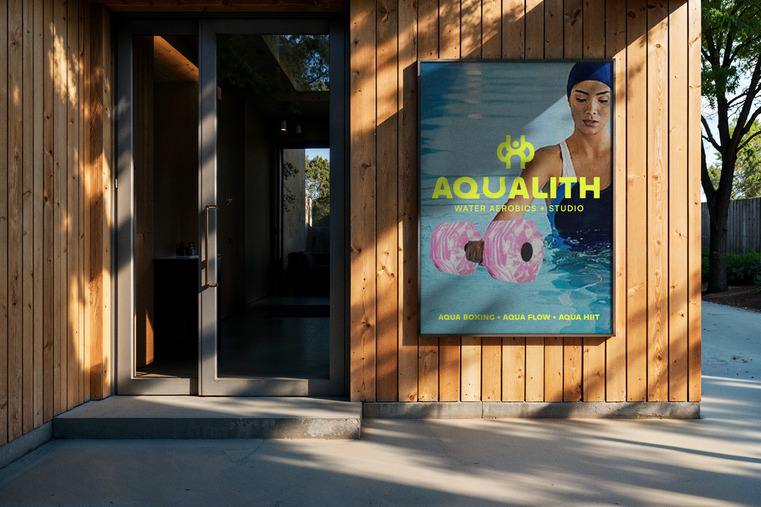
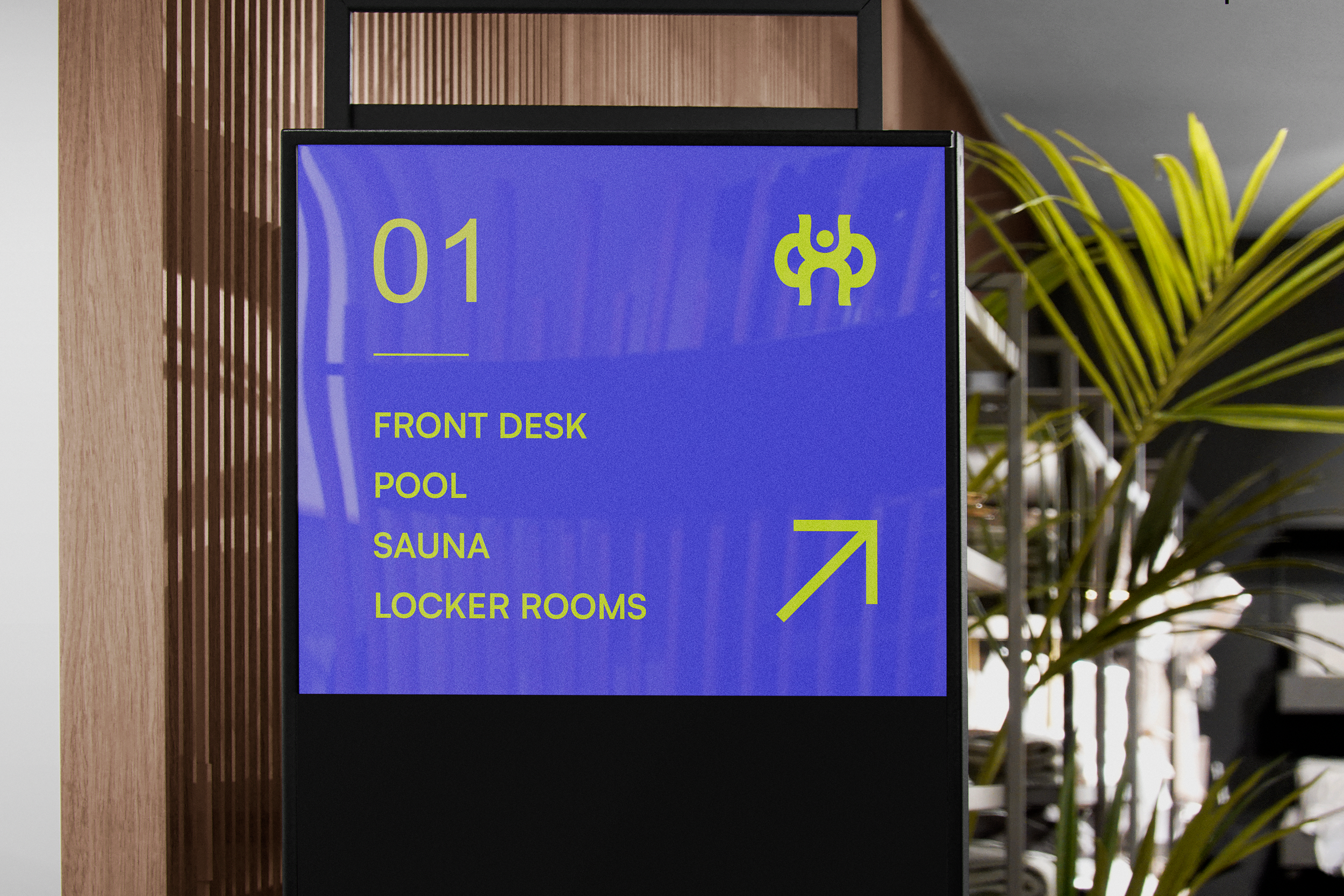
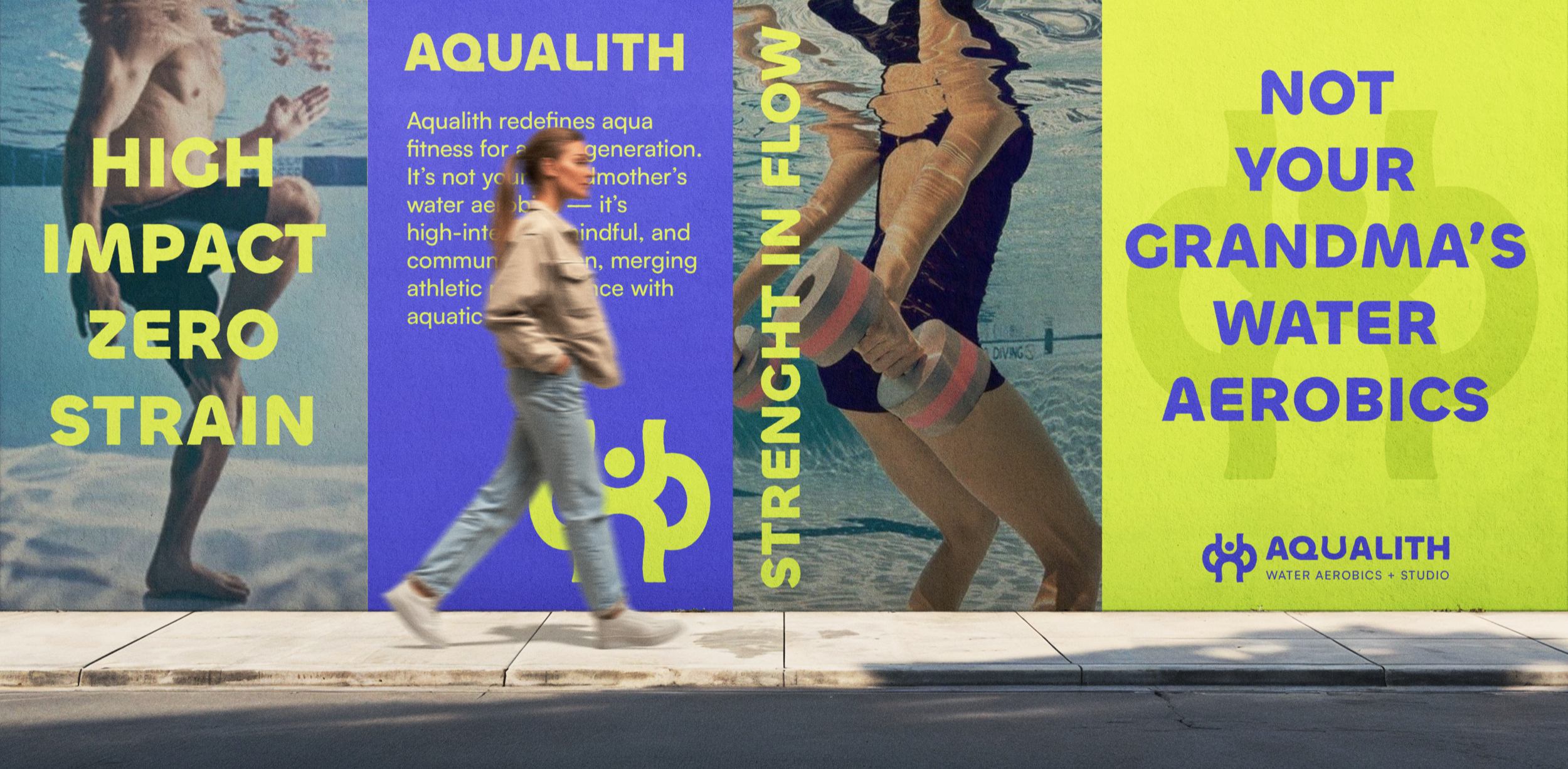
AQUALITH is a community-first aquatic fitness brand created to move, feel restorative, social, and accessible. Built around the belief that water strengthens both the body and the mind, the brand brings people together through dynamic pool-based group classes, recovery sessions, and community wellness events. AQUALITH is defined by flow, balance, and the uplifting feeling of buoyancy — a fitness experience grounded in togetherness.
Project Year: 2025
Role: Brand Identity Design | Concept Development | Visual Direction

Visual Identity
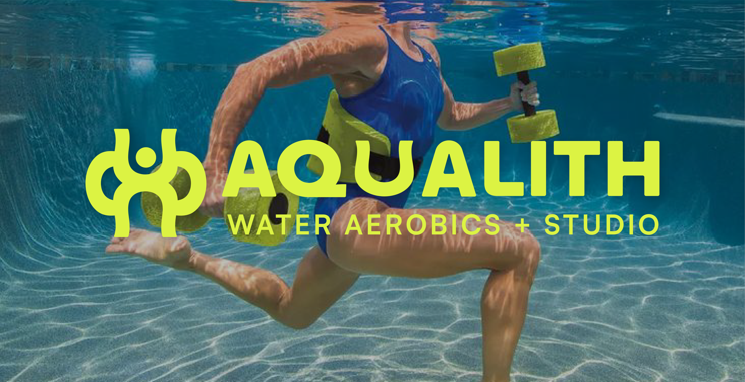
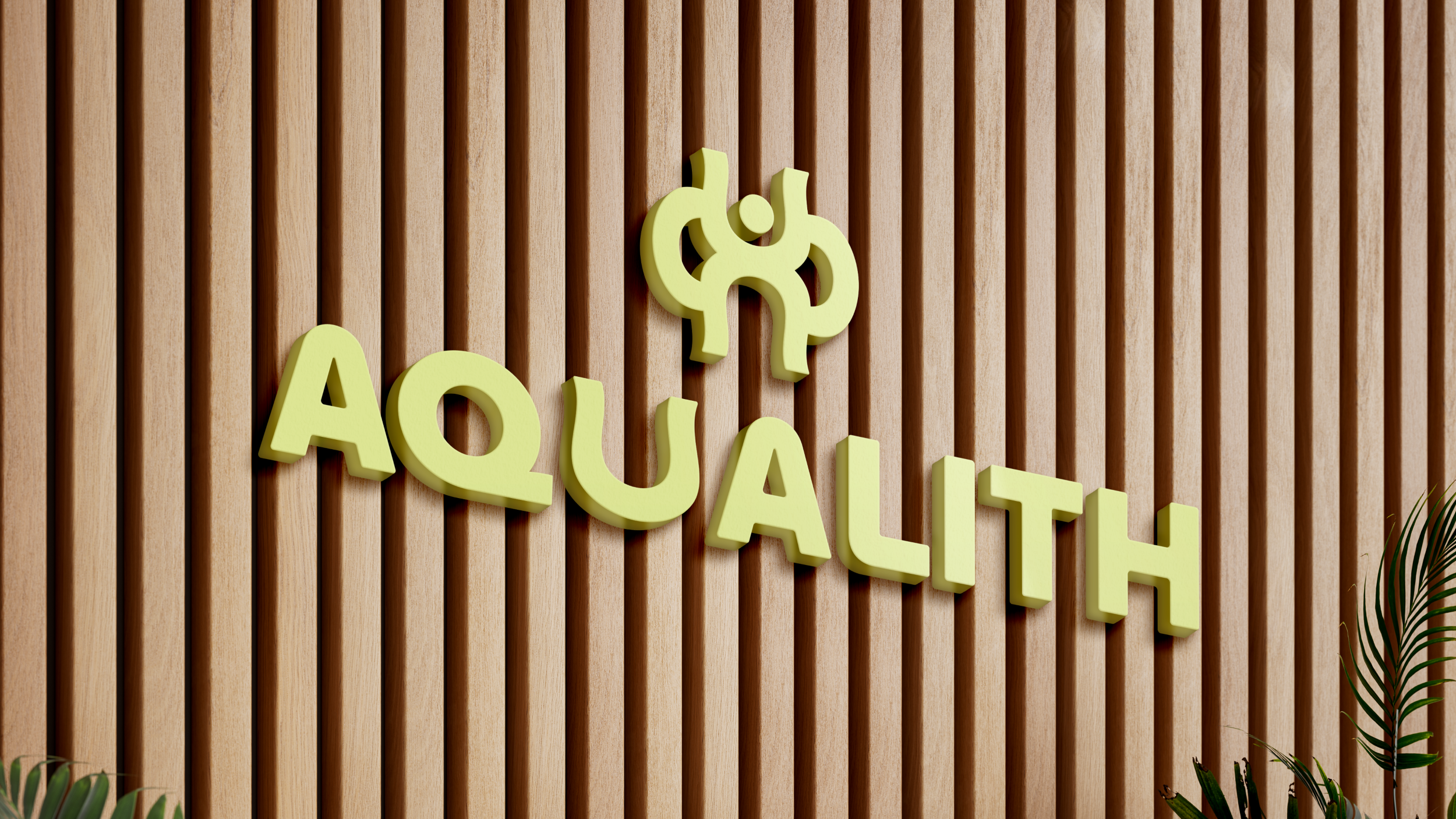
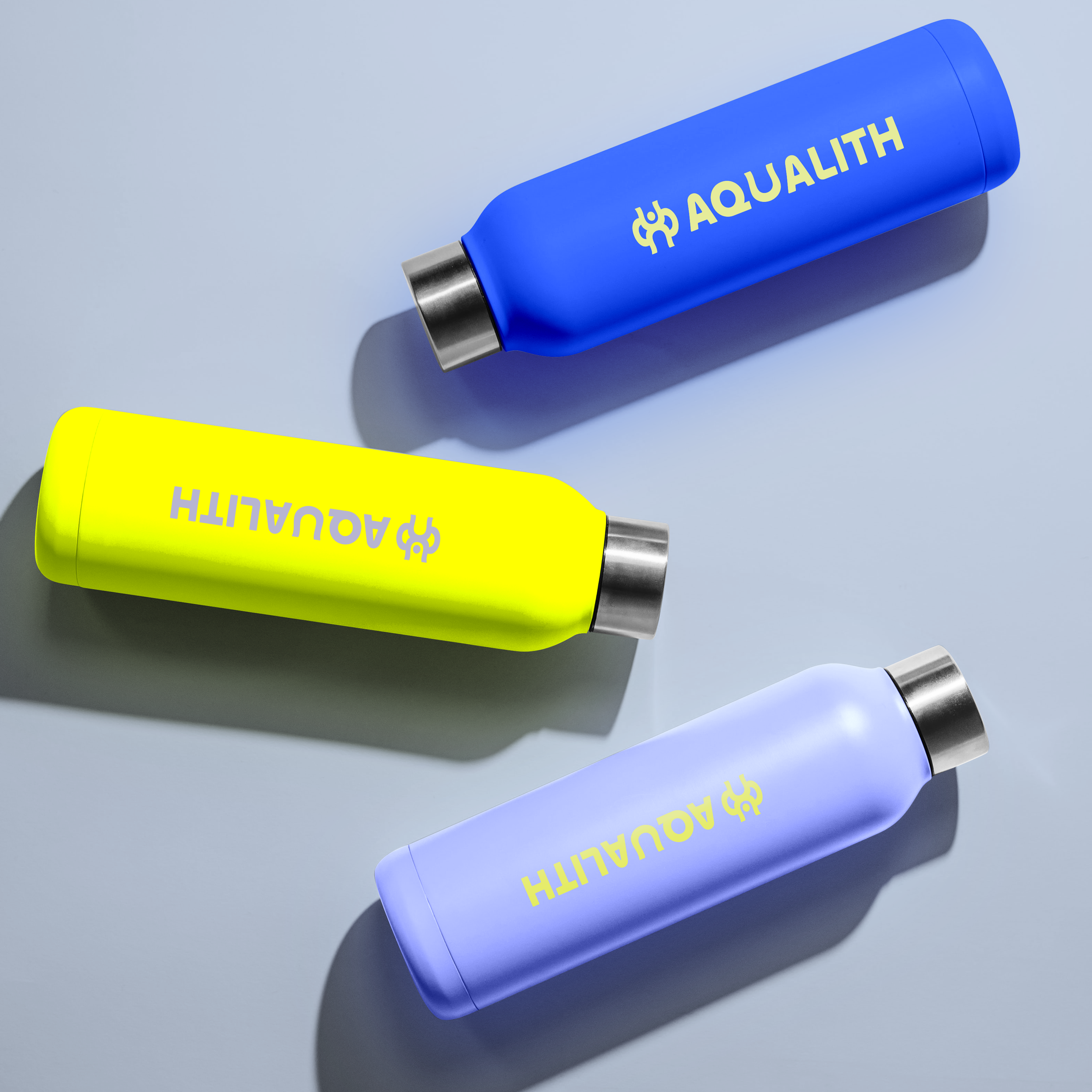
AQUALITH’s primary mark is a custom wordmark designed for clarity and character. The letter U features a gentle wave curve, symbolizing the flow of water and evoking the playful shape of a pool noodle — a core tool in aquatic fitness. This subtle modification gives the wordmark personality while grounding it in the brand’s aquatic roots.

Brand Concept and Strategy
The central idea is “Flow as Strength.” AQUALITH embraces the natural support and resistance that water provides, positioning fitness as something approachable rather than intimidating. The brand strategy focuses on inclusivity, highlighting the benefits of aquatic movement for every age and body type. Water becomes the universal equalizer — supportive, forgiving, and empowering. The visual and verbal language reflects this balance of softness and strength.